EcoDesignCloud
Two and a half years as the sole UI designer of a SaaS that turns life-cycle analysis into retail decisions.
- Role
- Sole UI designer, start to finish
- Period
- 2022 → summer 2025
- Context
- Atos / Eviden, from a L'Oréal deployment to a multi-client platform
- Tools & stack
- Figma · FigJam · GPT · Illustrator
Mandate
An environmental assessment SaaS (life-cycle analysis, PEF indicators) for retail. Sole UI designer for two and a half years: identity, the main modules' interfaces, the design system.
Challenge
Simplify sixteen scientific indicators without impoverishing them, and hold ultra-personalisation together: every client picks their background and accent colour, the data must stay readable everywhere.
Solution
Progressive reading levels with constant visual codes, functional glassmorphism that guarantees contrast, and a UI kit grown into a documented design system.
Results
From MVP to a commercial solution, deployed at L'Oréal and then adopted far beyond.
- companies
- 600+
- countries
- 35+
- L'Oréal brands
- 24
- LCA projects initiated
- 20,000+
Product-wide, whole-team numbers, they give the scale. Sources: official EcoDesignCloud website (2026); L'Oréal Finance press release (May 2024).
The full story, decision by decision
EcoDesignCloud was born with a strong stance: ultra-personalisation. Every brand, every user can change their interface background and accent colour, so the product carries their personality. Glassmorphism was the technical answer: translucent surfaces that stay readable over any background. My job, for two and a half years: making that ambition, plus tables of sixteen environmental indicators, hold together in a product that went from one client to hundreds.
The problem
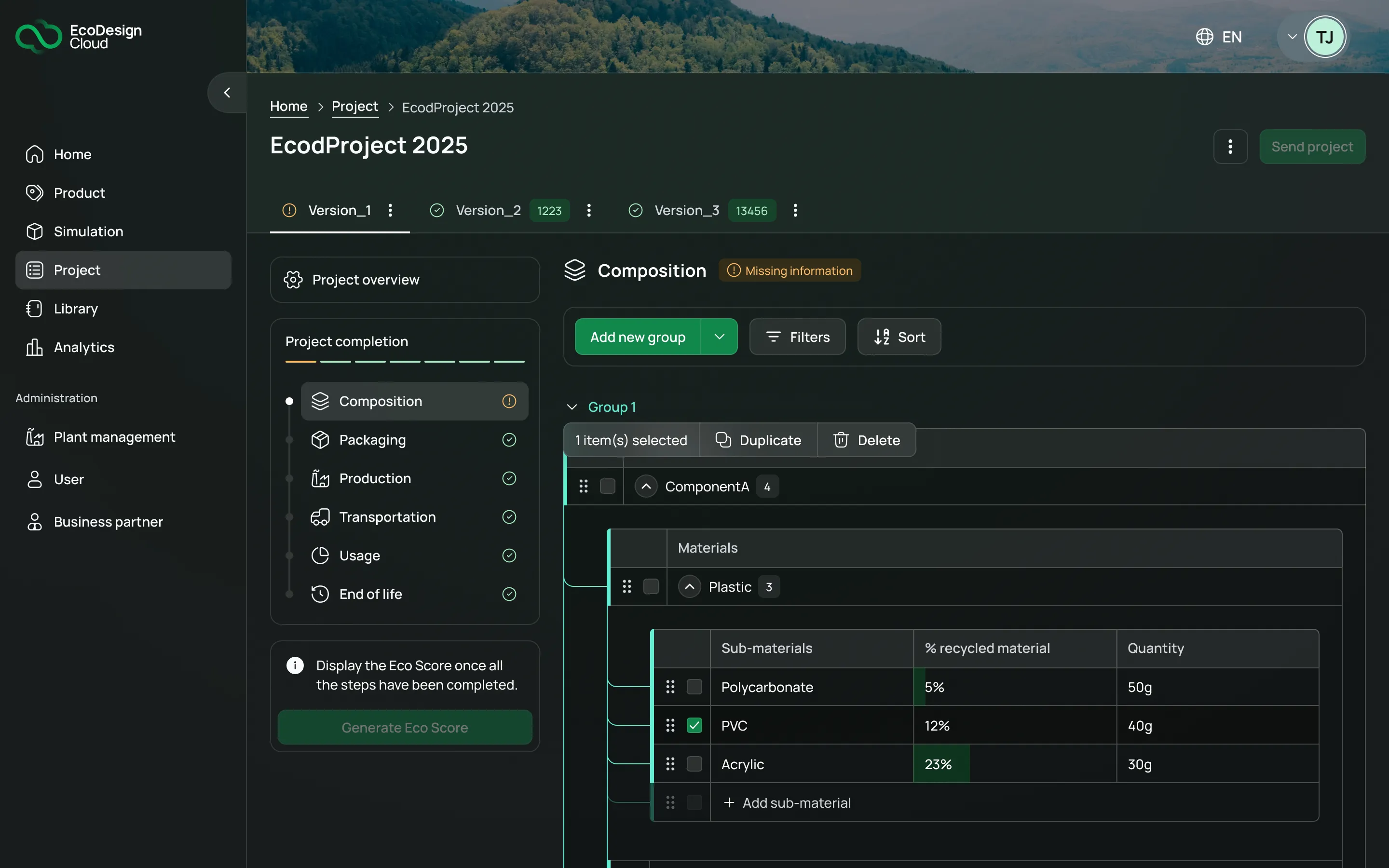
A traditional life-cycle analysis is slow, expert-driven, and hard to fit into the pace of a retail project. EcoDesignCloud automates part of the calculation and renders results as scores, charts and comparisons. The design question was therefore: how do you simplify scientific data without impoverishing it, so that very different people (designers, buyers, CSR leads, suppliers) can choose what to produce, and who to buy it from? The composition screen at the top of this page condenses it: a recursive hierarchy edited inline, and an Eco Score locked while data is incomplete, catching errors before the calculation.
The decisions
Glassmorphism had a reason to exist
The tension. Ultra-personalisation makes readability unpredictable: a table of sixteen indicators must stay readable over a forest photo as over a dark flat colour, because the background belongs to the user.
The choice. Embrace glassmorphism as the base (translucent surfaces that hold over any background), with a strict hierarchy of surfaces: personality lives in the scenery, data lives on controlled panels where contrast is guaranteed.
What it cost. A far more demanding contrast-and-states system than with a fixed background. And a lesson in humility: the founding idea outlived every debate. When I left, the default was still a brand green and a forest background.
A reading level is not an expertise level
The tension. The product rests on sixteen PEF impact indicators, plus KPIs like carbon and water. A single score is instantly readable, and wrong the moment it is taken as absolute truth. Showing everything drowns the non-expert.
The choice. Organise the interface in progressive reading levels: an at-a-glance synthesis, then a descent into detail without changing the visual logic: same scales, same codes, same legends. And design from the start for states where data is missing, estimated or not comparable.
What it cost. Far more hierarchy and dataviz work than “score + charts”, and constant back-and-forth with LCA experts to simplify the data without betraying it.
From UI kit to design system
The tension. Personalisation multiplied by growth: every combination of background and accent colour multiplied the states to maintain by hand. In a UI kit it was hell to manage, and the product was going from one client to dozens, fast.
The choice. Turn the UI kit into a structured design system: background and accent become variables of the system, not exceptions. Foundations, components with variants and states, usage rules, documentation. A language belonging to EcoDesignCloud (not a client derivative), customisable by construction.
What it cost. Spending time on work nobody sees while everything goes fine. The return: fewer improvised decisions at integration time, and a personalisation that survived scaling without fragmenting the product.
Designing with the debt, not against it
The tension. The project grew faster than the team could build. Some mockups could not be integrated right away, or exactly.
The choice. Systematically document expected states and variants to limit interpretation, run regular integration reviews, and prioritise the most visible or blocking gaps. Keep in Figma and the design system a coherent reference the product converges towards, release after release.
What it cost. Accepting, for good, that the live product is not the mockup. And being able to say in front of everyone what comes from design and what comes from technical constraints, without blaming anyone.
What I would do differently
Set the design system’s rules earlier (who decides, who validates) and check whether it is actually used. The system served well; I can’t prove it with numbers.
Define a visualisation strategy for the sixteen indicators before multiplying charts, rather than consolidating it along the way.
Measure the critical journeys: know where people give up, rather than guessing it from business feedback.